
Most "website animation examples" lists show you a GIF and a link to someone else’s site. You can’t tell how the effect feels when you scroll, how fast it is, or whether it would work on your own page. This one is different: every example below is a live demo you can interact with, plus a short note on when it helps and when it gets in the way.
The goal isn’t to make your site move more. It’s to make it move with intent — so visitors notice what matters and trust what they see.
What makes a good website animation?
A good website animation has a job: it guides attention, explains a sequence, or confirms an action. It’s fast, it doesn’t hide the content, and it respects visitors who prefer less motion. If you can remove an animation and nothing gets harder to understand, it was decoration — and decoration is where sites start feeling slow and generic.

Scroll animations
1. Stacked cards
Each card slides up and covers the previous one as you scroll, leaving a thin strip of every earlier card visible. By the end, the visitor sees the whole deck. Great for services, steps, or project lists.
How it’s built and how to add it: Stacked Cards for Elementor.
2. Sections that slide over each other
One section pins in place while the next one slides up and covers it — like sheets stacking. It marks a chapter change in a long landing page without breaking the scroll. See Scroll Stack.
3. Horizontal scroll
The page stops and the content moves sideways while you keep scrolling down. Perfect for galleries, timelines and step-by-step stories. See Horizontal Scroll.
4. Sticky scrollytelling
Text scrolls on one side while an image stays fixed on the other and changes with each step. The classic layout for product and feature pages. See Sticky Scroll.
5. Smooth scroll
Not a visible effect on its own, but the base layer behind every premium scroll experience: the page glides instead of jumping notch by notch. See Smooth Scroll.
6. Animated progress bars
Lines that grow from 0 to 100% when they come into view — for skill bars, stats and section dividers. See Progress Line.
Text animations
7. Blur text reveal
Headlines that go from blurred to sharp as they enter the screen, like a lens coming into focus. Subtle enough for serious brands. See Blur Text Reveal.
8. Scrolling text marquee
A band of text that loops sideways forever — for slogans, services lists or announcements. See Text Loop.
9. Glitch text
RGB channel split and flicker on hover, borrowed from CRT screens and cyberpunk design. Best used once, on a bold call to action. See Glitch Text.
Hover and cursor animations
10. Magnetic buttons
The button drifts toward the cursor as it approaches, then eases back. It rewards the visitor for moving toward your call to action. See Magnetic Button.
11. Sparkle buttons
Glowing stars burst out of the button on hover. Playful, great for launches and premium offers. See Sparkle Button.
12. Custom cursors
A circle that follows the pointer with a smooth lag and grows over links. Very common on portfolios and studio sites. See Follower, a custom cursor you enable site-wide with one toggle.
13. Image trail
Images appear along the cursor’s path and fade away — a playful way to show many visuals without a grid. See Image Trail.
Layout and page animations
14. Expanding cards
A row of image cards where the one you hover widens to reveal its content while the others shrink. See Expanding Cards.
15. Page transitions
A curtain, a circle or a pixel grid covers the screen when you click a link and pulls back on the new page, so the whole site feels like one continuous experience. Browse the transitions in the effects gallery.
How to choose the right animation
| If you want to… | Use | Avoid |
|---|---|---|
| Present services or steps | Stacked cards, sticky scroll | Animating every paragraph |
| Show a gallery or timeline | Horizontal scroll | Auto-playing carousels |
| Make a headline land | Blur reveal, text marquee | Animating all headings |
| Push the main call to action | Magnetic or sparkle button | Effects on every button |
| Give a creative site personality | Custom cursor, image trail | Hiding the real pointer entirely |
Two technical rules keep animation from hurting your site: load it only where it’s used, and respect the "reduce motion" setting in the visitor’s operating system. Google’s own research found that 53% of mobile visits are abandoned when a page takes longer than 3 seconds to load (Think with Google) — animation that slows the page costs more than it adds.
How to add these animations in Elementor without code
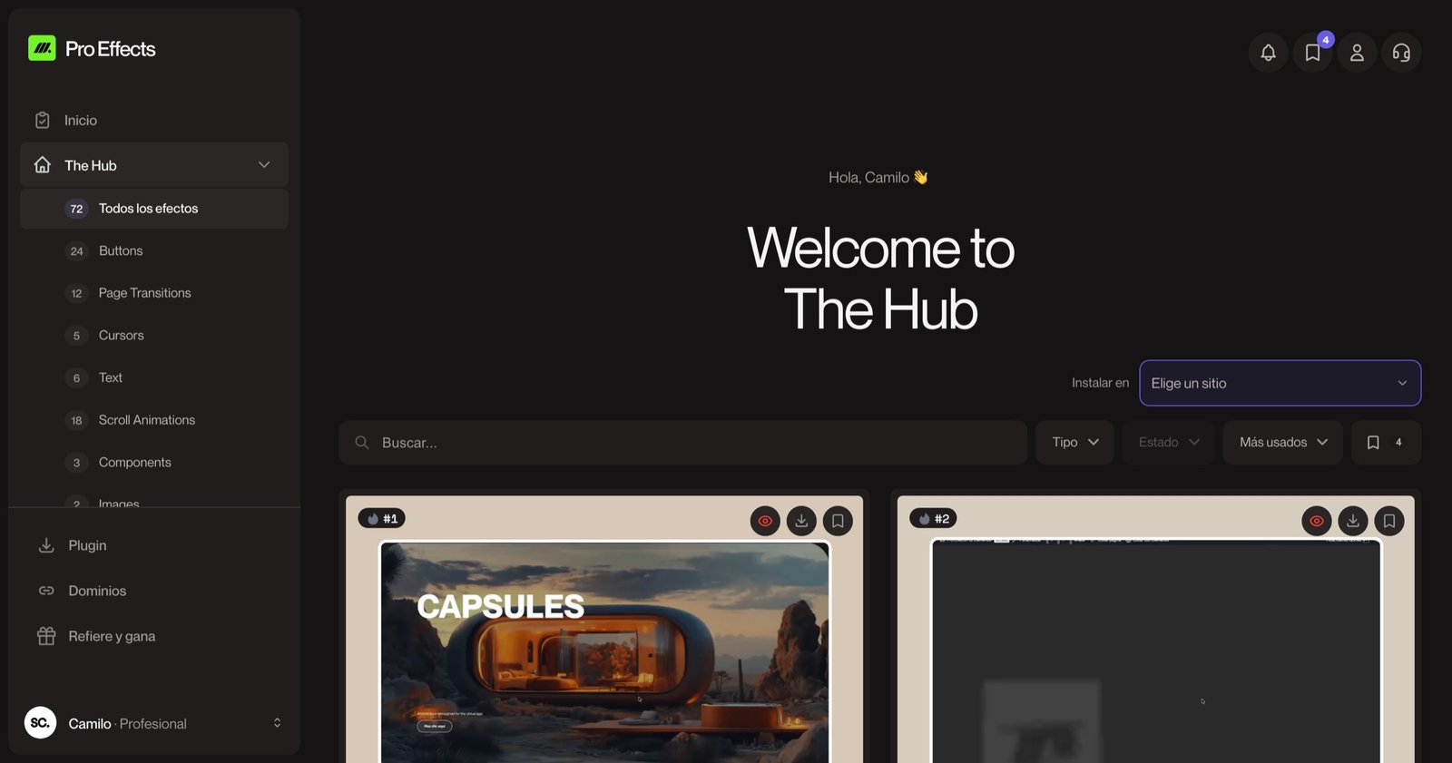
Elementor includes simple entrance animations (fade, slide, zoom). The effects on this page go further, and you can add them without writing code with Pro Effects: pick the effect, apply it from the Elementor panel, adjust a couple of settings. Every effect has a live demo in the effects gallery, so you know exactly what you’ll get before you install it.
You can try it free, no credit card required.
FAQ
Do animations slow down a website?
Only when they’re built heavily — a full animation library on every page, or effects that force the browser to recalculate the layout. Animations based on CSS transforms that load only where they’re used have minimal impact. Measure with PageSpeed Insights before and after.
How many animations should a website have?
As many as needed to guide reading, and no more. A good rule: one entrance effect per section, one standout effect in the hero or key block, and micro-interactions on the main buttons. When everything moves, nothing stands out.
What is GSAP?
GSAP is a JavaScript library for precise web animation, used by many award-winning sites. You don’t need to learn it to use advanced effects: Elementor animation plugins use it under the hood when it helps, and you simply configure the effect.
Are website animations good for conversions?
They help when they direct attention toward the action — a button that responds, a section that presents the offer at the right moment. They don’t replace a good offer or clear copy, but they make a page feel more professional and trustworthy, which influences the decision.
A website without motion isn’t wrong. A website with intentional motion feels premium. Add any of these effects to Elementor with Pro Effects — no code, no slowdown.