
Your call-to-action button is the most important element on the page, and on most sites it just sits there. A button hover effect is the small response that says "yes, click me" at the exact moment the visitor is deciding. The best ones are fast, clear and match the brand; the worst ones are slow, jumpy, or hide the label.
Here are 12 button hover effects that work, grouped by style, with when to use each one and how to add them to Elementor buttons without writing CSS.
What is a button hover effect?
A button hover effect is an animation that plays when the mouse moves over a button: the background fills, the text slides, an icon moves, or the whole button reacts to the cursor. It gives instant feedback that the element is clickable and draws attention to the action. On touch devices, the same styles usually appear on tap or focus.
Fill and wipe effects
1. Slide fill
A solid panel slides across the button like a sliding door and the text color flips. Clean and geometric — a safe choice for almost any brand.
2. Circle expand
A circle grows from the center (or from the cursor’s entry point) until it fills the button. Softer than a slide, great for rounded buttons.
3. Column wipe
Vertical columns enter one after another, like blinds closing over the button. Editorial, a good fit for fashion and design studios.
4. Pixel fill
A grid of small squares appears in a wave from one corner. Playful and tech-flavored.
5. Marker stroke
A hand-drawn zigzag "paints" the background from one side to the other. Friendly and human; nice for creative brands and education.
Text effects
6. Double text roll
The label slides up and an identical copy rolls in from below. Subtle, premium, and the most common effect on award-winning sites.
7. Letter bounce
Each letter hops in sequence from left to right. Playful — best for a single standout button.
8. Text shine
A metallic gleam sweeps across the text. Works well for premium plans and "Get Pro" buttons.
9. Glitch
The label splits into cyan and magenta channels that flicker. Perfect for gaming and tech — use it once. See Glitch Text.
Icon and motion effects
10. Icon slide
The arrow icon slides toward its side on hover. Minimal, and it points exactly where you want people to go.
11. Magnetic button
The button drifts toward the cursor as it approaches, with the label moving slightly more for depth. The most tactile of all. See Magnetic Button.
12. Sparkle burst
Glowing stars burst out of the button while it lights up. Made for launches, gifts and premium offers.
Settings and details: Sparkle Button for Elementor.
Which button hover effect should you use?
| Button | Good choice | Why |
|---|---|---|
| Main CTA in the hero | Magnetic or double text roll | Rewards the move toward the action without distracting |
| Pricing "Buy" or "Get Pro" | Text shine or sparkle | Adds value to the premium option |
| Secondary buttons | Slide fill or icon slide | Clear feedback, low noise |
| Creative portfolio | Marker stroke, column wipe | Personality without hurting clarity |
| Gaming / tech | Glitch or pixel fill | Matches the visual language |
Rules that keep hover effects from hurting conversions
- Keep it under ~400 ms. People move fast; slow effects feel broken.
- Never hide the label. At every frame of the animation, the button text should be readable.
- Use one style per role. All primary buttons share one effect; secondary buttons share another.
- Mind the contrast. The hover state must stay readable (text vs. new background).
- Support focus, not only hover. Keyboard users should see a visible state too.
- Respect reduced motion. Swap motion for a simple color change when visitors ask for less motion.
How to add button hover effects in Elementor
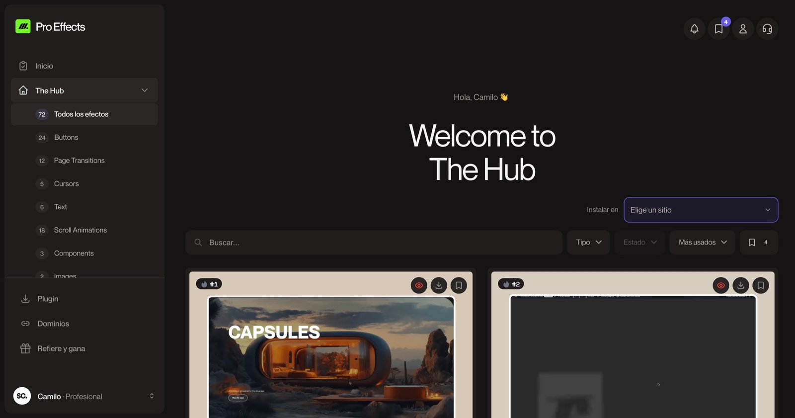
Elementor’s Button widget supports hover colors and simple hover animations such as grow, pulse or float. The effects above are available as extensions of the native Button widget with Pro Effects: add a normal Elementor button, open Advanced → Pro Effects – Buttons, choose the effect and adjust its colors and timing. Your existing buttons keep their styling, so you can upgrade them without rebuilding.
You can try it free, no credit card required. For effects beyond buttons, see our website animation examples.
FAQ
How do I create a hover effect on a button with CSS?
Use the :hover (and :focus-visible) pseudo-class with a transition on properties like background-color, color or transform. For fills and wipes, a pseudo-element (::before) that scales or moves behind the text is the usual technique. If you use Elementor, a plugin can apply these without writing CSS.
Do button hover effects work on mobile?
Phones don’t have hover, so the effect usually appears briefly on tap, or not at all. The button must look clearly clickable in its normal state; the hover effect is a desktop bonus, not the only signal.
Which button hover effect converts best?
There’s no universal winner; clarity beats flash. Subtle, fast effects on the primary button (a text roll or a magnetic pull) tend to support the action without distracting. Test your main call to action and keep the effect consistent across the site.
Can too many hover effects slow down a site?
CSS-based hover effects are very light. Problems appear when each button loads its own heavy script or animation library. Choose effects that use CSS transitions and transforms, and load them only where they’re used.
Your button is where the decision happens. Give it a response worth clicking. Upgrade your Elementor buttons with Pro Effects — no code.