
The navigation is the one part of your site every visitor touches. That makes menu animation a small detail with a big effect: a hover that responds, a mobile menu that opens with rhythm, a header that gets out of the way when you scroll. Done well, the site feels crafted. Done badly, people can’t find the link they came for.
Here are 8 menu animation patterns that work, what each one is good for, and how to build them in Elementor.
What is a menu animation?
A menu animation is any motion in a website’s navigation: links that react on hover, a hamburger icon that turns into a close icon, a mobile menu that slides or fades in, or a header that hides, shrinks or changes color as you scroll. Its job is feedback and orientation — showing what’s clickable, what’s open, and where you are.

1. Hover underline
The most common and most useful: a line grows under the link when you hover it. It confirms what’s clickable without adding noise. Keep it fast (around 200–300 ms) and consistent across the whole menu.
In Elementor: the Nav Menu widget (Elementor Pro) includes pointer styles — underline, overline, double line, framed, background — each with its own animation. You set it once for the whole menu.
2. Background fill on hover
A soft background slides or fades in behind the hovered link. Works well for pill-shaped menus and dashboards where links need a larger target.
3. Hamburger to close (X) morph
The three lines of the hamburger icon rotate into an X when the mobile menu opens. It’s a tiny transition, but it tells the visitor the same button closes the menu — no hunting for another icon.
4. Full-screen overlay menu
On click, the menu covers the whole screen with large links that enter one by one. Very common on creative and portfolio sites, where the menu is part of the brand experience. Keep the number of links small; big type needs room.
5. Slide-in side menu
The menu slides in from the side and dims the page behind it. Better than a full-screen overlay when you have many links or sub-menus, because the context stays visible.
6. Hide on scroll down, show on scroll up
The header slides away when the visitor scrolls down to read, and comes back the moment they scroll up. It gives content more room on mobile while keeping navigation one gesture away. This is one of the most practical header behaviors you can add.
7. Shrinking sticky header
The header stays at the top but gets shorter after the first scroll — the logo shrinks, padding tightens. It keeps navigation available without eating the screen.
8. Color-adaptive header
The header changes its colors (and even swaps the logo) depending on the section behind it: dark text over light sections, light text over dark ones. It fixes the classic problem of a transparent header that becomes unreadable over some sections.
This is the kind of effect you can build without code with Pro Effects — for example, with Theme Zones the colors of the page swap automatically as you scroll through marked sections:
Which menu animation should you use?
| Goal | Best pattern | Avoid |
|---|---|---|
| Show what’s clickable | Hover underline or background fill | Effects slower than 300 ms |
| Clear mobile menu | Hamburger morph + slide-in | Menus that cover the close button |
| More reading space | Hide on scroll down, show on scroll up | Headers that never come back |
| Brand experience | Full-screen overlay | Overlays with 15+ links |
| Readable transparent header | Color-adaptive header | Fixed white text over mixed backgrounds |
Menu animation best practices
- Speed first. Menu motion should feel instant. If people wait for the menu, the animation is too long.
- Keep the target size. Animated links still need a comfortable click and tap area.
- Respect reduced motion. Visitors who turn on "reduce motion" in their system should get a static menu.
- Don’t animate what people need to find fast. Contact and pricing links should be obvious, not hidden behind a playful reveal.
For a wider set of effects beyond navigation, see our website animation examples with live demos, or browse the full effects gallery.
FAQ
How do I animate a menu in Elementor?
With Elementor Pro’s Nav Menu widget you can choose a pointer style (underline, overline, framed, background) and its animation for the whole menu. For header behaviors like color changes by section, you can add a dedicated effect from a plugin such as Pro Effects, applied from the Elementor panel.
What is a hamburger menu animation?
It’s the transition of the three-line menu icon into a close icon (usually an X) when the mobile menu opens, and back when it closes. It tells visitors that the same button opens and closes the menu.
Should the header hide on scroll?
On content-heavy pages and on mobile, hiding the header while scrolling down and showing it on scroll up is a good balance: more room to read, navigation one gesture away. On short landing pages, a simple sticky header is usually enough.
Do menu animations affect SEO?
Not directly. What matters is that the links are real HTML links that search engines can follow, and that the animation doesn’t slow down the page. CSS-based hover effects have virtually no performance cost.
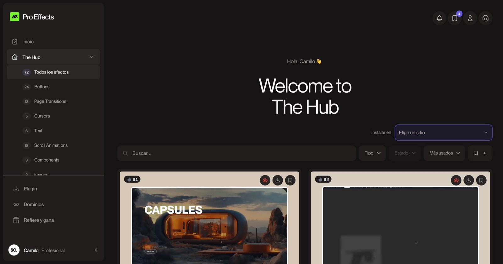
Good navigation motion is felt, not noticed. Add header and hover effects to Elementor with Pro Effects — no code needed.